Carbon Dashboard
Check the dashboard here: https://blog-version-indu4lxlqa-ez.a.run.app/
Idea
In this blog post. I’m going to show how I made a web dashboard tracking the emissions of trucking user. It can be adjusted for other methods of tracking emissions. I got the idea from a start-up called PlanA. Which specialises in developing technology that calculates a company’s emissions. And gives them suggestions to reduce them. I also thought that it may be a good idea to continue the carbon emission API I developed. Where a user can come to one place to get their emissions.
Forecasting
The dashboard will be showing a line graph of the emissions created by the user. I think a good idea for the dashboard is to have a forecast of the emissions. To see if the user is on track. To do something like that we need to do a time series analysis, as we are tracking data over some time. They are two main routes to do a time series analysis. There is the traditional way of using statistical techniques like ARIMA, SARIMA. And the new machine learning way. Building Machine learning models to learn from the data. With model structures like LSTM and RNN.
An example of machine learning being used for forecasting is predicting the power output of renewable energy. As renewable energy is harder is dispatch on demand. Unlike fossil fuels. DeepMind was able to increase the economic value of a wind farm by 20%. By forecasting the power output over 16 days.
Developing the ML model
To first to develop any ML model. You need data. The bread and butter of a machine learning model. First, I googled around for some type of data about road freight. I did not find what I wanted. So, I went to Microsoft excel to create dummy data. With the columns of date, miles, tonnes, tonnes/miles, and CO2. The date was chosen by me. And I used to autocomplete fill out the rest of the rows. Then I produced miles and tonnes. They were randomly generated. And tonnes/miles were the miles and tonnes multiplied. And the CO2 column was calculated by multiplying the mile-tonnes column and with a carbon factor. And then dividing to one million. Division converts the CO2 grams to metric tons.

After that, I googled around to find a model that I can use for time series data. I found a TensorFlow example from google. Where they used an LSTM network. To forecast a weather time series. First used one variable from the dataset. The second used multivariate data. To forecast the graph.
While developing the model I noticed while training the model the validation loss. Will spike up later into the training session. To deal with I had to add many customisations into the model. I changed the sizes of the batches. Changed the number of epochs.
I later decided to increase the data size. The model was struggling with overfitting. And answers describing overfitting normally said it not enough data. I Increased the number of rows to 500. Compared to the 100 rows before. The model only improved marginally. Then I looked closer at the data. Then I noticed that the data had a high variance. Which may be affecting the model training. As it was struggling to find patterns. So, I adjusted the data to have a normal distribution. So, less variance can be in the dataset. I gave it to the model and had some improvement.
=NORMINV(RAND(), 350, 5)
I got this function from this YouTube video. The function creates a distribution with a random probability. Provided by RAND(). Then the mean is either the miles or tonnes depending on the column. Then 5 or another number is the standard deviation.
But the model was still struck. After a lot of training and changes. I only got the model to have a loss of around 65%. Which means it still guesses wrong most of the time.
Some images of one of the training sessions:
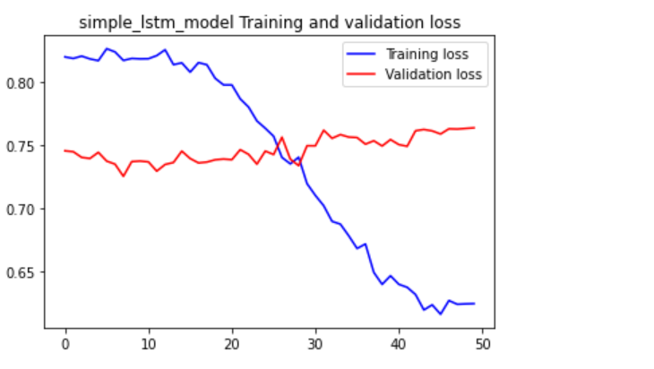

We can see here the validation data does not reduce. Or the training loss decreases slowly. Which means it still may be overfitting.
I think is because the dataset is random. The reason why I think it’s the dataset, not the model. Because the dataset has a lack of clear patterns. For example, every Friday the user drives 100 miles. Most data will have some pattern to them. But random data is random. So, it’s hard to find patterns when something is random. So, something I need to investigate more making dummy data without being too random. The distribution change to the data was a good start.
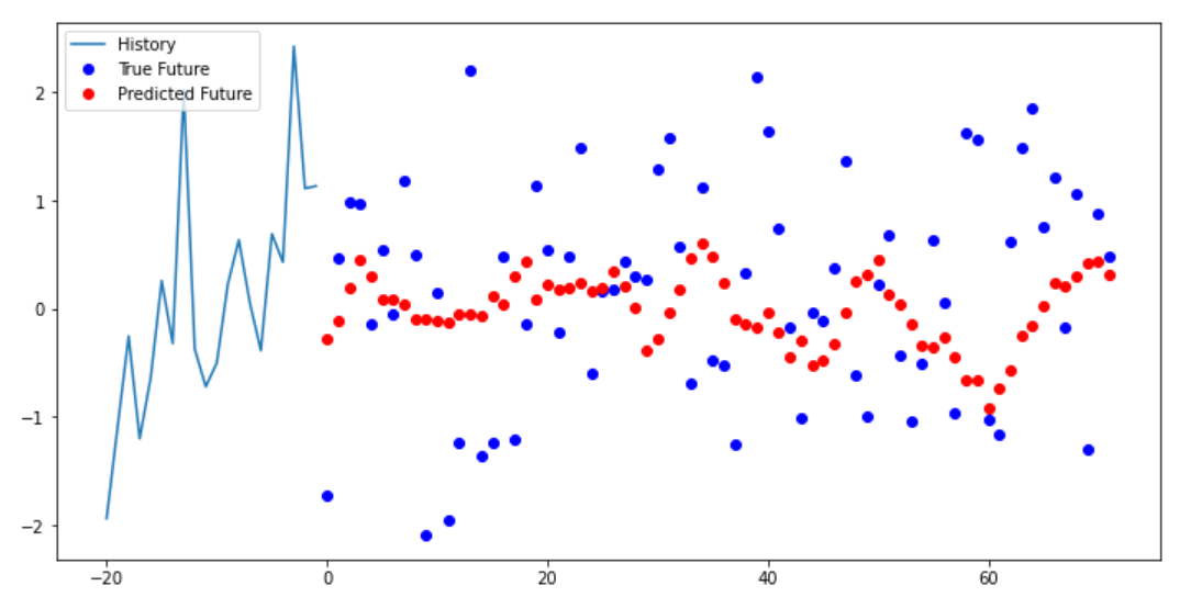
We can see below the multi-step model trying to predict the next data points. The model we can see can get some type of pattern. But the data itself is very random. As the data points are all over the place. Causing the model to get its predictions wrong.
Developing the dashboard
I did not want to make a dashboard from starch. As that will take too long. And it’s not my area of expertise. I found a template I can use called Flask dashboard argon. By Appseed and Creative Tim. Provides a clean UI with bootstrap. Provide SQL database and authentication

Figure 1 https://appseed.us/admin-dashboards/flask-boilerplate-dashboard-argon
First, I made a few changes with the top stats to get a feel of the code. Then moved to the main focus which was changing the charts to display custom data. From the dataset showing the emissions of the user. I first tried doing so with the “data-toggle” feature. An attribute from the template. Which changed the data of the chart. After using it I noticed a few issues. That when I added more data than the x-axis labels showed. Then the chart will continue off-screen. The second and most important that the scale of the CO2 emissions was very small compared to the sales numbers. So, the CO2 numbers did not show.
So, I had to find a way to change the numbers with the data-toggle. To do that I had to go into the code of the dashboard itself. And edit the chart.js properties. I was able to get better results, but the CO2 numbers were not showing up correctly. And each time when I hover over the chart. It reverts to the default state. I was able to fix the reversion glitch by updating the JavaScript min files. By compressing JavaScript where I was doing the edits. And replacing the default min file with mine.
Editing chart.js
I used the dataset that I produced in excel. I copied the columns of CO2 and date separately. As the chart only took a small amount of numbers, before the chart they went off-screen. Also, I needed to adjust the settings of the chart. To remove the dollars signs that signify currency. Also, the “k” that represents a thousand dollars. While using the data-update attribute. You could change the data-suffix and data-prefix attribute. But didn’t work when hovering the chart. The data-prefix and data-suffix should change the format of the y Axis. But that did not happen. So, I had to fix that.
To the Y axis I found need to edit a function in setting the chart. Callback has a function that added extra characters to the value.
ticks: {
                  callback: function(value) {
                    if (!(value % 10)) {
                      return '$' + value + 'k';
I changed it into this:
ticks: {
              callback: function(value) {
                if (value) {
                  // return '$' + value + 'k';
                  return value + ' Tons of CO2'
                }
The if (!(value % 10)) returned a value did not have a reminder of 10. This made sure the Y-Axis went up in 10s. Then the value with Dollar signs is returned. This made the Y-Axis. I edited it so all values can be returned and added ‘Tons of Co2’ as a suffix.
To fix the hovering glitch. I had to change the callbacks of tooltips:
tooltips: {
    callbacks: {
    label: function(item, data) {
    var label = data.datasets[item.datasetIndex].label || '';
    var yLabel = item.yLabel;
    var content = '';

    if (data.datasets.length > 1) {
    content += '<span class="popover-body-label mr-auto">' + label + '</span>';
    }

    content += '<span class="popover-body-value">$' + yLabel + 'k</span>';
    return content;
    }
After:
tooltips: {
          callbacks: {
            label: function(item, data) {
              var label = data.datasets[item.datasetIndex].label || '';
              var yLabel = item.yLabel;
              // console.log(yLabel);
              // console.log(label);
              var content = '';

              if (data.datasets.length > 1) {
                content += '<span class="popover-body-label mr-auto">' + label + '</span>';
              }

              content += '<span class="popover-body-value">' + yLabel + ' Tons of CO2</span>';
              // console.log(content);
              return content;
            }
I mainly edited the span to get rid of the dollar sign and replacing with ‘Tons of CO2
Then the chart gets the labels and data.
data: {
      data: {
        labels:  ['2019-02-05', '2019-02-05', '2019-02-06', '2019-02-06', '2019-02-07', '2019-02-07',  '2019-02-08', '2019-02-08'],
        datasets: [{
          label: 'Performance',
          data: [0.74, 0.86, 0.70, 1.03, 1.28, 1.17, 1.00 , 0.56]
        }]
      }
Adding the forecast chart
After that, I needed to make a chart a forecast. They used the data from the excel dataset. Rather from the ML model. Like I mentioned before that chart only allows for a few data points. Before the chart looks incomplete because of the data points loading off-screen. So, I only added two extra data points.
The chart has a bootstrap button that toggles different charts. I repurposed them for the forecast and week chart. I created a separate forecast class. So, JavaScript can call on that element. Editing the HTML so the button toggles to the forecast chart. First, it did not work correctly as the chart appeared just below the normal chart. Also, behind the page visits table. So, it was not visible as well.
I needed to find a way to hide the chart. And only show if the user clicked the forecast button. To do that I needed to add some extra JavaScript. First, I added a jQuery function that when forecast button was clicked then, the weekly chart will be hidden. But when I clicked the week button again. The chart did not toggle back. Therefore, I had the change the JQuery code again. This time the chart forecast started as hidden. After it was initialised. Then a jQuery function shows the forecast chart. And hides the sales chart. It does vice versa with the sales chart.
$('#chart-forecast').hide()


  $('#forecast_tab').on('click',function(){
      $('#chart-forecast').show()
      $('#chart-sales').hide()

   });

   $('#sales_tab').on('click',function(){
       $('#chart-sales').show()
       $('#chart-forecast').hide()

    });
Now the chart worked correctly:

Changing top stats
After that, I did minor edits to the top stats on the website. This was simple compared to the editing of the charts. As I just had to edit the text.
Then I changed the table below the chart. The content was showing page traffic to the website. I changed to show carbon offset programmes that the user can buy.
The edits I made was changing the text. Deleting columns. And adding buy buttons to the rows.
The names and the prices of the carbon offset programmes. I got from the website Gold Standard. A popular distributor of carbon offset projects. I replaced the default text in the table with information from the site. Then I replaced the last column with a button asking the user to buy the carbon offset.
Formatting table
After that, I deleted the section of the website that I did not need. The website had a social media section tracking traffic from social media. I deleted that section. Leading to more space on the website. After the social media section got deleted the table seemed out of place. Because the placement assumed that the social media section was there. To centre the table to the centre of the page I found out I needed to add row justify-content-center to the div class row that contains the table. After I added that the table was centred to the page.
Default page:

My page:

Deployment
To have an interactive example that I can show you. I need to deploy the website on a server. I decided to use google cloud. As I already have an account. Flask Dashboard Argon comes with a docker file. Which I can use to deploy.
I will be deploying the website using google cloud’s cloud run service. That allows you to publish containerised apps. Using the cloud SDK, I ran this command to start the building of the container.
gcloud builds submit --tag gcr.io/PROJECT-ID/helloworld
Then we can see the process below:

Then I got this error and other similar ones:
denied: Token exchange failed for project 'carbon-dashboard-kdjfka'. Caller does not have permission 'storage.buckets.create'. To configure permissions, follow instructions at: https://cloud.google.com/container-registry/docs/access-control
To fix this issue I gave myself extra permissions to use the cloud storage resources.
Afterwards I got this error:
Container failed to start. Failed to start and then listen on the port defined by the PORT environment variable
But I was able to fix the issues by changing the container port. Which was set to 8080 by default. So changed it to 5050. Which is the container port in the docker file.
I forgot to turn off the website login. As example website have a person sign up for account is not useful. To fix that I had to into the flask routes files.
@blueprint.route('/index')
# @login_required
def index():

    # if not current_user.is_authenticated:
    #     return redirect(url_for('base_blueprint.login'))

    return render_template('index.html')


@blueprint.route('/')
def route_default():
    # return redirect(url_for('base_blueprint.login'))
    return render_template('index.html')
I disabled the redirection to the login page. So, the user can go straight to the index page.
Then I made a new google cloud build. So, it can be deployed.
You can check the deployment here: https://blog-version-indu4lxlqa-ez.a.run.app/
Little skin in the game for our beliefs
I was just reading an article about crony beliefs, by Kevin Simler on Melting Asphalt. The article introduces us to the topic of beliefs that are not factually correct. But hold social value. The idea builds upon the work of Jonathan Haidt. With the righteous mind. Where In the righteous mind Jonathan introduces the idea that we hold beliefs of social reputation not mapping reality. For explaining beliefs Kevin uses that analogy of an employee and a company. A belief are employees. And the company is use. For a normal company is the employee does not perform well. Then the employee will have to be let go. A belief performing well is having it closer to reality. To help us success in an area we choose. Kevin says that acts as the bottom line.
But then Kevin adds a twist to the analogy. By pretending that a company will need to hire some people not based on their qualifications or skill. But for political gains. In this pretend company some people need to get hire to appease city hall so they can get new contracts. And if you zoom closer to the employee’s working there you noticed. That some of the employees are not pulling their weight but not getting fired. This because they special hires. Namely friends and family. A more formal word for this is cronyism.
The first example with the normal company and people being hired for skill. Is a meritocracy. Where people fall or rise based on their performance. The second example is the opposite where it is little correlation between performance and movement within the company. Cronyism.
Using the analogy Kevin goes on to explain for practical examples on how that can affect people day to day.
Kevin quotes Steven pinker:
People are embraced or condemned according to their beliefs, so one function of the mind may be to hold beliefs that bring the belief-holder the greatest number of allies, protectors, or disciples, rather than beliefs that are most likely to be true.
It reminds me again of the righteous mind by Jonathan Haidt. Because that in the book Jonathan explained that are brain is working to helps us in many ways. Using old caveman software. But trying to find the truth is not high up the priority list. Especially if it decreases your social standing. Find the truth is not always good for survival. Therefore, in areas like religion and politics. Trying to find the truth or prompting reason is not advertised. As those areas mainly arose out of the use for human to collaborate in groups. And a person trying to destroy that harmony is not good for the tribe. Kevin adds: “When we say politics is the mind-killer, it's because these social rewards completely dominate the pragmatic rewards, and thus we have almost no incentive to get at the truth.”
Which makes sense for the reason above. If your religion helps your tribe through a serious drought. People in the tribe are less likely to question it. As it helped the tribe service. So, beliefs need to be useful first before we start talking about the truth. Not the other way round.
Kevin says:
If you've ever wanted to believe something, ask yourself where that desire comes from. Hint: it's not the desire simply to believe what's true.
Like from the book elephant in the brain. Written by Kevin as well. Explores this area in large detail. Where the brain can lie to ourselves. For more social clout. For example, A YouTuber might say that he or she is doing this to help people and to entertain them. But a more selfish reason. Is to collect more fame and money. The first answer provides people a positive message. Boosting the person social reputation. While the second reason may be more honest as it deals with are base instincts. But likely does not increase are social reputation. So are brain puts in the back of are mind.
In article Kevin example that agendas that can help us keep a corny belief.
One example he gives is Cheerleading:
Cheerleading. Here the idea is to believe what you want other people to believe — in other words, believing your own propaganda, drinking your own Kool-Aid. Over-the-top self-confidence, for example, seems dangerous as a private merit belief, but makes perfect sense as a crony belief, if expressing it inspires others to have confidence in you.
I like this example. As you see it all lot in technology start up space. Where you have founders, with extreme sense confidence in their product. With little evidence backing it up. But if you dig a little bit deeper you learn that it’s necessary for company to succeed. But the founder needs a belief in one’s company to attract employees and investors. No one wants to work for a company that’s people think its going to fail. Nor do investors want to invest in a company that does not give a chance of succeeding. But sometimes this can go awry. As founders drink the Kool-Aid too much without giving back real results.
Wework was a famous start-up with the goal of producing co-working spaces. The founder was charismatic and that help him promote the company and was able to get investing from the biggest technology fund (The Vision Fund). But the company later imploded when it tried to get the company public, but analysts noticed that they were losing a crap ton of money without a chance of turning a profit. It all fell like a house of cards. As other investors left. And stories started to come out about the founder doing odd things. Like walking barefoot around the office. And screaming at employees when his favourite tequila was not in the office.
Another example was a biotech company called Theranos. Which claimed that with a single blood drop it can spot all manner of diseases. But later to found out it was not true. But the founder was charismatic and was able to secure funding in the billions. The large claims lead to great marketing for the company. As Elizabeth Homes (The Founder) got featured on the covers of time Forbes and Fortune. But as people later found out that the produce did not do as it was promised. To be honest this company is fascinating story of the lies and deception that she did. But luckily some person already wrote a book about that. Called bad blood. And should be turned into a movie relatively soon. They are very interesting videos detailing this story. Check this video which interviews the author of the book and this video which a documentary about the whole ordeal.
The Internet is becoming private
The internet is becoming more private. The threat of getting cancelled and better monetisation of content elsewhere. Means that people are getting jaded with public platforms. So, people are retreating into the private corners of the internet. Where the risk of problems is reduced. Places where the public are less likely to bring pitchforks. Social media companies are not promoting questionable content in the name of engagement. And creators having a closer connection with their audience.
Venkatesh Rao calls this the cosy web.
Venkatesh Rao:
Unlike the main public internet, which runs on the (human) protocol of “users” clicking on links on public pages/apps maintained by “publishers”, the cozyweb works on the (human) protocol of everybody cutting-and-pasting bits of text, images, URLs, and screenshots across live streams. Much of this content is poorly addressable, poorly searchable, and very vulnerable to bitrot. It lives in a high-gatekeeping slum-like space comprising slacks, messaging apps, private groups, storage services like dropbox, and of course, email.
A popular medium article talking about the same phenomenon where the author called it the dark forest.
Yancey Strickler:
Imagine a dark forest at night. It’s deathly quiet. Nothing moves. Nothing stirs. This could lead one to assume that the forest is devoid of life. But of course, it’s not. The dark forest is full of life. It’s quiet because night is when the predators come out. To survive, the animals stay silent.
…
This is also what the internet is becoming: a dark forest.
In the article, Yancey Strickler states that darks forests are growing because it allows people to be themselves. He gave the example of himself where he felt most comfortable sharing the idea first on his email lists.
Dark forests like newsletters and podcasts are growing areas of activity. As are other dark forests, like Slack channels, private Instagrams, invite-only message boards, text groups, Snapchat, WeChat, and on and on. - Yancey Strickler
My analogy for all this is a simple storefront. Think of a public network like a storefront or a billboard. It is very flashy and loud to get the attention of passer-Byers. Now when you get into the store it is a lovely experience. The building feels cosy. And the staff are helpful. You may have a personal relationship with the owner. He also gives you special offers and treats. While outside people may think the store serves no interest to them. You are having a blast in the shop. Outside the shop, people are only trying the teasers. Where the shop hopes for the passer-by to buy-in.
Privacy
Private networks have more piracy. Due to them not being open to the public. Group texts are used in place of social media. As it’s a great service to connect with friends and family. Without a public audience watching. Or a social media company sharing your content to people you don’t know.
Patreon a service used for online creators to get money directly from their fans. Also creates a more private community. By a simple paywall. Creators can be more daring in their videos and provide exclusive content. Without the threat of losing monetisation on videos or the need to worry if their work is going to offend a select group of people.
With Patreon, you can see some YouTubers gaining more confidence. As they know if it’s a video that they feel is politically correct or the YouTube algorithm will not monetize the video. They know they publish it on their private community. For the audience to enjoy. While still on the YouTube platform creators will keep timid so the YouTube algorithm does not nuke their channel. As the YouTube recommender system is the most important marketing channels for YouTube. Like a store having there mass adverting as safe. Not to be banned by adverting companies.
Email lists
A growing network promoting more private communities are email lists. Emails are not owned by one platform. So, a company can’t ban you from sending emails by breaking terms of service. Emails are normally free. And the writers of the newsletter sent exclusive content over email. That has less of them risk getting them cancelled. Increasing there are some newsletters that you have to pay for. This is due to a service called Substack. Which allows writers to charge for their email list. It works like a magazine. The reader pays a monthly or yearly fee to access the newsletter. Like Patreon, this helps writers create content without falling into the algorithm adverts model.
Writers can decide on having some of their issues free. Normally used as a preview for the newsletter. Or the writer can mainly produce free content but have exclusive content under a paywall.
Free content is the storefront
Back to the storefront analogy. Free content produced on public networks is the storefront. Private networks paid or otherwise is like you are inside the store picking the products. For paid services like Substack and patron the quality will tend to be better and they more focused on making a small audience happy. And avoiding the algorithm hamster wheel. When checking up the individual items in the shop. It's like getting the exclusive backlog of the creator. Participating in Q&As is like talking directly to the store manager. Talking the exclusive items in the shop. And goals and plans of the business.
Wellbeing on social media
The vibe in these private networks tends to be calmer. As algorithms trying to drive engagement. Which tend to promote negative emotions and anger and resentment. In the dark forest article. The author pointed towards a paradox. Where if you leave the mainstream networks will decrease it in quality. Even if your experience of the internet improves. As lots of other people will still be using public networks. And if the less savoury characters say the quality will not improve.
The meaning and tone of these platforms changes with who uses them. What kind of bowling alley it is depends on who goes there. - Yancey Strickler
People will always want to use public networks. But people will be spending less time on these services. Which is probably not good for the tech companies, money-wise. In Cal Newport’s book digital minimalism. Cal Newport recommends only using social media of features that you find useful. Not the newsfeed. Like the example, I mentioned earlier of talking to friends and family via group chat rather than Facebook.
Spotting Trees with Deep Learning
Idea / Inspiration
I’m creating a project that can spot trees, using satellite data. I got this idea from the company 20tree.ai. Which uses satellite imagery and AI to track forests and vegetation around the world. They are many uses for this technology. You can track deforestation in an area. By tracking the amount of missing trees over a certain timescale. A company called Spacept uses satellite imagery and AI. To prevent fires and power outages by spotting trees growing too close to power lines.
Using satellite imagery saves time and money. As inspecting forestry using a helicopter or drone can cost a lot of money. And will cost a lot of time, to set up the helicopter and drone to fly over the forestry.
Dataset
When I was first trying to get the dataset together for the machine learning model. I settled on using google earth engine. I got this idea from this medium blog post. Which used satellite imagery to spot landslides. In the blog post he highlighted the issue of getting satellite data. Where if you wanted to get images from the ESA Copernicus SciHub website. You will have to do them manually. And you cannot add coordinates of an area you want to capture. So, you get continent sized images. Which I can agree from my personal use of the service as well. When I tried to get an image that covered a small area in my city. Instead I got large images covering all of France and Britain.
With Google earth engine you can filter by date, area, and cloud cover. Which is why Google earth engine was recommended. I used the code from the blog to create a dataset. I added customisations to the code for my dataset. The blog post described the process below:
How our final (semi) automated pipeline ended up working was as follows:
1. Enter coordinates intocropping_coordinates.py to calculate the coordinates of a 10 km square.
2. Copy the output and replace the variables at the top of the JavaScript code in the Google Earth Engine console (the JavaScript code we used). Don’t forget to change the date range to one that you’d like.
3. Download the images with less than 100 for the mean cloud density given by clicking the link printed in the console output.
When I got the images, they looked like this:

In the beginning I did not know why this was the case. But later learned that satellite images were separated into different bands. Bands are certain wavelengths that the satellite captures. Doing this allows the user to view the image with features that are not visible with human eye or can be highlighted with a chosen wavelength. For example, a common use of satellite imagery is tracking farmland. By using the infrared spectrum, it is more easier spot vegetation.

Figure 1 This false-colour image of Florida combines shortwave infrared, near infrared, and green light. (NASA image by Matt Radcliff with Landsat 5 data from the USGS Earth Explorer.)
Also found here: https://earthobservatory.nasa.gov/features/FalseColor
Wikipedia gives a nice list of wavelengths and their uses:
The wavelengths are approximate; exact values depend on the particular satellite's instruments:
Blue, 450–515..520 nm, is used for atmosphere and deep water imaging, and can reach depths up to 150 feet (50 m) in clear water.
Green, 515..520–590..600 nm, is used for imaging vegetation and deep water structures, up to 90 feet (30 m) in clear water.
Red, 600..630–680..690 nm, is used for imaging man-made objects, in water up to 30 feet (9 m) deep, soil, and vegetation.
Near infrared (NIR), 750–900 nm, is used primarily for imaging vegetation.
Mid-infrared (MIR), 1550–1750 nm, is used for imaging vegetation, soil moisture content, and some forest fires.
Far-infrared (FIR), 2080–2350 nm, is used for imaging soil, moisture, geological features, silicates, clays, and fires.
Thermal infrared, 10400-12500 nm, uses emitted instead of reflected radiation to image geological structures, thermal differences in water currents, fires, and for night studies.
Radar and related technologies are useful for mapping terrain and for detecting various objects.
Also, combinations:
True-color uses only red, green, and blue channels, mapped to their respective colors. As a plain color photograph, it is good for analyzing man-made objects, and is easy to understand for beginner analysts.
Green-red-infrared, where the blue channel is replaced with near infrared, is used for vegetation, which is highly reflective in near IR; it then shows as blue. This combination is often used to detect vegetation and camouflage.
Blue-NIR-MIR, where the blue channel uses visible blue, green uses NIR (so vegetation stays green), and MIR is shown as red. Such images allow the water depth, vegetation coverage, soil moisture content, and the presence of fires to be seen, all in a single image.
I wanted a simple RGB image. Which is simple visible light. As its best to start simple. To develop that, we need an image that combines all 3 bands into one. So, using some of the google earth engine example code and my personal changes. I was able to get some images.
The red square covering the map is the area that google earth engine will capture for the image.

The image below:

As we can the image quality is horrible to be frank. I started to notice problems when setting up the red square. You see in the image of the general area of outside the red square. You can see that image lacks clarity. Which means if you zoom in even further you cannot tell what’s in the image because the quality is pretty bad.
The reason for the problem was the resolution of images. The satellites sentinel-2 and Landsat only have a resolution 30 meters.
This website explains spatial resolution perfectly:
Spatial resolution refers to the size of one pixel on the ground. A pixel is that smallest ‘dot’ that makes up an optical satellite image and basically determines how detailed a picture is. Landsat data, for example, has a 30m resolution, meaning each pixel stands for a 30m x 30m area on the ground. It’s considered a medium-resolution image, which can cover an entire city area alone, but the level of detail isn’t fine enough to distinguish individual objects like houses or cars.
Custom Dataset
All open source data goes down to 30 meters. For finer data one must pay. So I had to find a solution that allows me get higher quality images. Without forking small fortune.
After a lot thinking (and worrying). I found the solution hidden in plain sight. When using navigation systems on your phone. Your phone can give you a satellite image of your area. You can see which buildings are which. And differentiate between objects. So I decided to use (normal) google earth and capture images straight from the website. To make sure the screen captures where all the same size used a program called PicPick.
Here’s one image I captured:

Now we differentiate between objects. Namely trees.
Labelling data
Now we have a small sample size. We need a solution for the machine learning model to know it ‘s looking at a tree.
So used a program called LabelImg from GitHub. Which I used to manually label the trees in the images.

I did not label every single tree in every image. As that will take forever. But wanted to have some labelling so the model can pick one or two trees in the test image. Same reasoning why the dataset is very small. The reasoning is so if I need to make changes to the dataset. It won’t take a long time. Also, just to create a model as simple prototype before scaling up the work.
Model
This project is an object detection problem. As I’m dealing with image data. I will be using some type of Convolutional Neural Network. One example I was thinking of using for the model is here. But quickly learned that as the model was already trained the model won’t be able to read satellite image for trees. The blog post mentioned you do transfer learning or fine-tuning. But said t that it was outside the scope of the article. So, I had to find a new model to use.
R-CNN
After a while of googling around. I found an interesting model that I can use called R-CNN. More precisely faster R CNN. R CNN which stands for Region-Based Convolutional Neural Network. Where the model selectively goes through many 2000 proposal regions of the image. After the proposal regions are selected, they then shaped for the input of the Convolutional Neural Network. After Support vector machines classify the regions. Then a bounding box regression is used to work out where the box goes.

But they are a few problems relating to using a traditional R CNN. Mainly that processing an image takes a lot of time. As the model is extracting 2000 regions to check. Prediction with the model takes around 40 seconds.
Fast R-CNN
A better version of R CNN was created by the same person. Called Fast R CNN. Main difference is instead of extracting thousands of regions from the image. Fast R-CNN inputs the whole image. Then the CNN produces a convolutional feature map from that the chosen region proposals. The region proposals are then shaped for the pooling layer. After that it gets reshaped again to be entered into a full connected layer. For each region of interest feature vector, it is moved to a SoftMax layer to predict the class. The use of bounding box regression to find the boxes.
One problem is that as Fast R-CNN uses selective search is slowing down testing. But Fast R-CNN is way faster than the traditional R-CNN. As Fast R-CNN takes around 2 seconds to predict.
Faster R-CNN
Now we have faster R-CNN. The examples above uses selective search to go through proposal regions. Faster R-CNN uses a separate network of predict the region proposals. Using the convolutional feature map. Then the proposals are then reshaped for a pooling layer. For classification of the region. Also bounding box regressor used to place the images.

Figure 3 https://www.analyticsvidhya.com/blog/2018/10/a-step-by-step-introduction-to-the-basic-object-detection-algorithms-part-1/
Coding up the of model
I followed tutorial from here. The tutorial used a dataset of blood cells. I replaced the dataset with my custom dataset of google earth photos. To get the data ready for the model I had to convert the bounding boxes from XML to CSV.
To do that I used pandas and python’s ElementTree module. And borrowed code from machine learning mastery and the export file linked in the tutorial.
df = pd.DataFrame(None, columns=['filename', 'tree_type', 'xmin', 'ymax', 'ymix', 'ymax'])
list_dataframe = []
folder = 'Custom_dataset\\Labels'
This section sets up the variables to be used for the loop. An empty dataframe is set up with the name of the filenames, class and the bounding boxes. The path of folder containing the images are saved in the folder variable.
for file in os.listdir(folder):
        path = 'Custom_dataset\Labels\\'
        file = path + file
        print(file)
The start of the for loop starts by listing the files in the folder. Then the file path then printed by combining the folder path and name of the file. This is done as a normal for loop without os.listdir did not work on my laptop.
filename = re.sub('Custom_dataset\\\Labels', "", file)
filename = filename.replace("\\", "")
filename = filename.replace(".xml", ".png")
When printing the filename it had too many backslashes. So to get rid of it str.replace functions were used. Also, as the folder it using the label names not the images. The filenames ended in XML. So, replaced to PNG filetype.
tree_type = 'Tree'
    tree = ElementTree.parse(file)
    # get the root of the document
    root = tree.getroot()
    # extract each bounding box
    boxes = list()
The section parses through the xml file. Crates the name of the class. In tree_type. tree = ElementTree.parse(file) parses the file. Then root = tree.getroot() gets the root of the file. And saves bonding box in a list.
for box in root.findall('.//bndbox'):
            xmin = int(box.find('xmin').text)
            ymin = int(box.find('ymin').text)
            xmax = int(box.find('xmax').text)
            ymax = int(box.find('ymax').text)

            row_list = [filename, tree_type, xmin, xmax, ymin, ymax]
            print(row_list)

            list_dataframe.append(row_list)
The for loop goes through each of the boxes and extracts the coordinates. Of the four corners of the box. Then a list is created which saves the filename, class, and coordinates. Then appended to the dataframe from earlier.
print(list_dataframe)

df = pd.DataFrame(list_dataframe, columns=['filename', 'tree_type', 'xmin', 'xmax', 'ymin', 'ymax'])

print(df.head())

df.to_csv('testing.csv', index=False)
After that list_dataframe containing all the data of the files. Is then added into another dataframe with the column names. And df.to_csv turns the dataframe into a CSV file.
Implementing the model
Now the tutorial asks for use to convert the CSV file into txt file. As the model uses a different format.
filepath, x1,y1,x2,y2,class_namefilepath is the path of the training image
x1 is the xmin coordinate for bounding box
y1 is the ymin coordinate for bounding box
x2 is the xmax coordinate for bounding box
y2 is the ymax coordinate for bounding box
class_name is the name of the class in that bounding box
Now the tutorial asks us clone this GitHub repository. When I ran the model I got a few errors. So, I went inside the repository and edited the code. Most errors were AttributeError: module 'keras.backend' has no attribute 'image_dim_ordering'. I found this helpful GitHub issue answer solving the problem. This is because some of the code used is deprecated. And you need to use the new keras API which has different names for the functions.
So, after a few hours of googling other issues the machine learning model started to run. I used a google cloud deep learning VM to train my model.

Due to the amount of time. A decided to reduce the amount epochs to 5. As each epoch took 4 hours. And the default number was 1000. Which will take couple of days to train and quite a bit of money.
Now I needed to test model. I did this on my laptop. As Google’s VM did not show images
To do this I ran the statement:
python test_frcnn.py -p test_images

The output shows it found some trees:


The model was able to find some areas with trees. Mainly thick forestry.
But others, not at all:


It looks like the model can’t point individual trees. But it can point to big areas forestry.
Improvements
Like I mentioned above the model can’t spot individual trees. But areas of forestry. But even then with the areas of forestry. It can only spot some sections. A few small boxes cover a large area of forestry.
The dataset was kept brief. So, I can get a workable prototype up and running. Labelling can be improved by boxing every single tree in an image. And having custom segmentation for areas forestry. Instead of boxes to cover an area of forestry.
The dataset is very small (20 images) and trained for only 5 epochs. This can be improved by simply adding more images to the dataset. And spending more time training the model.
A serious question to ask is, how I would label a large dataset. Labelling 20 images was already long enough. By manually labelling the trees. Took around hour or so. Can’t imagine how to label thousand images by hand. Also, with custom segmentation for large areas forestry I’m not sure how to make custom shapes. To cover the shape of the forestry. As the program I was using only allows for boxes. Not custom shapes like polygons.
The use of applied technology
I was listening to a podcast by Lex Friedman an AI researcher, interviewing Jeremy Howard the founder of fast.ai. I found the podcast very interesting.
Theory Vs Practice
In the middle of the podcast, Jeremy Howard states that most deep learning research is useless. As scientists need to work on areas that their colleagues are familiar with. So, they generally work on the same field of research. With little practical value.
One issue he gave as an example is active learning. When a user is explicitly giving feedback to the model. By labelling the data. This is an important topic when you have a custom dataset. As need a way to tell the model exactly what you are looking for.
An interesting idea they talked about is using large dataset can hinder your creativity. Relying on large datasets makes people think that they need to have a large amount of resources (e.g. multiple GPUs) to train deep learning. Also, it shuts out people who did not think they can use deep learning without large resources. Also, they added that recent progress that came from the filed did not involve datacentre level resources. Examples like Batch normalization, Dropout, Rectified Linear Unit (ReLU).
In the podcast, Jeremy was asked about what he learned from teaching the fast.ai course. He replied that anyone can learn deep learning. With the main factor being tenacity. After that Lex asked how a person can become a deep learning expert. Jeremy replied train lots models. But later added that you want to train lots of model in your domain area.
Jeremy stated that deep learning is already a powerful tool. So, trying to work out how to get incremental improvements in a few areas. Is not as good as using deep learning to other fields to solve problems and gain new insights.
The use of domain expertise
This makes me think about the history of computers and the internet. Where lots of the gains did not just come from only getting faster. Yes, having faster computers and faster internet is helpful. IBM mainframes to personal computers. And Dial-up internet to fibre optic. This progress has allowed most people to get their hands on the technology. Helping them solve their own problem with these tools.
Accountants use computers. To keep track of financial information of the company. People post video tutorials on YouTube. So, they can learn new skills online. Artists share art on Instagram. For an interested audience.
Backend work was done to make these examples possible. But it may not have been too useful if many people did not use these tools to solve their own problems.
Think about modern smartphones, Smartphones are getting faster and getting new features every year. The phone makers like Apple and Samsung. Like to dance around on stage to tell us this. But has any big gains came of these modern innovations. No. Most people already have a fast-enough smartphone that solves their personal problems. Why does a customer need a double-sided phone? Or a phone that that bends? Hint: He doesn’t.
When the first Smartphones came out, they came with excitement. Because they solved problems like they never did before. And getting them into people’s hands created lots of value alone. As people thought of new ways of how a smartphone can be used. And phone makers add new features adjusting to people’s habits of using a smartphone. This created a positive feedback loop of innovation.
I read an example were a radiologist trained a machine learning model to look for fractures in x-rays. It was trained using Google’s no-code machine learning tool. Which means it does not need to be complicated to solve a problem. Another example, from a video I watched. Where civil engineers trained a machine learning model to look for broken pipes. As this is something that civil engineers must do a lot in the beginning of their careers. She found a way to make it way more efficient and solved a problem plaguing the industry. Saving young civil engineers from watching hours of footage to look through a cracked pipe.
My story about learning theory but not practice
Back to machine learning. Because even though I was able to learn a lot. I think was only able to starch the surface of what is possible with deep learning. I was able to get a basic understanding of deep learning. But if I remember I did not make many custom projects. As I was simply adjusting TensorFlow and YouTube tutorial examples.
Custom projects if I remember fell apart or never got finished. Which means my knowledge of deep learning is mainly theory but not practical. I can explain the data pipeline to train a model. But I will struggle to build one myself. I can explain what a GAN is. But I will struggle to make one myself. I know what an image classifier is, but can I send you a link of a custom-made example?
Most of these questions the answer is no. But I want to change that. Recently I have been reading and watching about how to use machine learning to help solve climate change. It struck me how much potential there is to solve the world’s most pressing issues. These issues can be helped with just an out of the box machine learning model. Not a cutting-edge model with 10 million bells and whistles. I want to be part of that change making a difference. This is done by solving problems in the real world.
Jeremy says deep learning is a high leverage skill. I believe we can use that tool for good. And to do so we must use these to solve problems that we are dealing with right now. Like I mentioned with the examples of the internet and computers. The amount of value created by normal people learning how to use those tools is enormous. Same with deep learning.
How I created an API that can work out your shipping emissions
Inspiration
I’m developing an API in python that will calculate emissions produced when shipping products around the world. I got this idea from a website called patch. The company offsets carbon by working out the emissions generated when shipping a product.
Calculations
To work out the carbon emissions, I will need to collect the distance travelled. Mass of the item. And type of transport used. The distance and mass are needed to work out the unit of tonne/mile or tonne/km. This is a simple measure that shows how one kilogram or short ton moves for one mile or kilometre.
For calculating a truck delivery, I used a formula from the Environmental Defence Fund an American non-profit.
Step 1: Determine the total amount of ton-miles. Multiply 1,000 miles times 20 tons, which gives us a total of 20,000 ton-miles.
Step 2: Get the weight-based truck emissions factor for a freight truck. The average freight truck in the U.S. emits 161.8 grams of CO2 per ton-mile.
Step 3: Multiply this emissions factor with the total ton-miles {161.8 X 20,000), which gives us a total of 3,236,000 grams of CO2.
Step 4: Convert the total grams into metric tons. Metric tons are the standard measurement unit for corporate emissions of greenhouse gases. There are 1,000,000 grams in a metric ton. To convert our answer from step three we divide it by 1,000,000. This gives us 3.24 metric tons of CO2 for this one move.
For the next section of the API. I calculated a maritime freight journey. I used a formula by the European Chemical Transport Association.

Here is a template below showing how the formula can be used for different modes of transport.

I will be using the Deep-sea container example for a carbon factor. As that closely resembles maritime transport.
Flask RESTful
To develop the API I will be using Flask-RESTful. Flask-RESTful is a Flask extension that helps abstract away some of the work of building an API. To start, you need a class that will define your API application. Flask-RESTful uses an object called resource which accesses multiple HTTP methods that you can use for developing your API. I’m going to partly explain the example code they show on their website:
The code is highly based on normal Flask. I’m going to skip to part where it is the defining class TodoSimple(Resource). The TodoSimple is the name of the class therefore the API. The class uses the Resource object mentioned above. Next, the example defines the HTTP methods we want to use.
def get(self, todo_id):
            return {todo_id: todos[todo_id]}
This defines the get method. Which fetches data from the API. The method calls the instance with self. And todo id. The class method returns a dictionary with todo_id as the key. And content with accessing the todos directory earlier with the todo_id. Having the content return as dictionary means it can be accessed as a JSON file later.
def put(self, todo_id):
        todos[todo_id] = request.form['data']
        return {todo_id: todos[todo_id]}
This method is very similar to the get method above. Only thing added is allowing a user to send data to the API. todos[todo_id] = request.form['data'] adds a todo item using a request form.
api.add_resource(TodoSimple, '/<string:todo_id>')Sets the routing for the class developed. /<string:todo_id>'means to access the class you will need to input a todo ID. The string: sets up a variable that accepts text.
To access the API. Use a HTTP service of your choice that allows you sent and receive requests.
Here’s an example from the website:

Code for road freight journey
More work has been done under the put method. As we want the user to add data into the API and return the number of emissions produced.
A piece of code I did not explain in the example is called reqparse. The function allows you set validate requests. By setting arguments.
parser = reqparse.RequestParser()
        parser.add_argument('miles')
        parser.add_argument('tons')
        parser.add_argument('ton_miles', type=float)
        args = parser.parse_args()
The parser is set up by saving reqparse.RequestParser() in a variable. After, you can use it to add new arguments. I used the parser.add_argument for miles and tones. So, the user can input the number of miles and tons. parser.add_argument('ton_miles', type=float) sets type to float to allow decimal numbers.
args = parser.parse_args() folds all of these arguments into a variable. Now the argument can be accessed with a key. The name of the argument is the key. Ex: args['tons'], args[miles].
This is how I used the args variable in the code:
if args['miles'] or args['tons'] is None:
            ton_miles = args['ton_miles']
The code sets up an if statement which checks if the miles and tons arguments are empty. Then proceeds to store the ton_miles argument into a variable. This is done if the user uses ton_miles argument which does not need either tons or miles. As ton/miles calculation of distance times mass.
if args['ton_miles'] is None:
            miles = float(args['miles'])
            tons = float(args['tons'])
            ton_miles = miles * tons
The if statement checks if the ton_miles is empty. Then proceeds to take the miles and tons arguments. And calculates the ton/miles by using numbers provided by the user.
grams_of_CO2 = 161.8 * ton_miles
metric_tons = grams_of_CO2 / 1000000

Emmisons = round(metric_tons, 2)
Now we start calculating the carbon footprint. By using the formula from the environmental defence fund mentioned earlier in the blog post. grams_of_CO2 = 161.8 * ton_miles calculate the amount of CO2 grams produced. This is done by multiplying the ton/miles with a carbon factor. The grams of CO2 are then converted into metric tons. This is done by dividing the grams of CO2 by 1,000,000.
Emmisons = round(metric_tons, 2) round the metric tons by two decimal points. To avoid trailing decimal points.
calculations = {'Emmisons': str(Emmisons) + ' metric tons CO2'}

        return calculations, 201
The emissions are shown in a dictionary. The emissions variable is changed to a string. So the text ‘metric tons CO2’ is appended next the emissions. Now the calculations variable which holds the information of the emissions is returned. With the status code 201. Status code 201 means request has been successfully created.
Using Postman
To test the API, we are going to use a program called postman. Postman is a program that allows you test APIs by using various HTTP methods. Postman has a lot more features like making documentation, automated testing, designing APIs etc. But I’m sticking to using the put method so I can send input to the API.
I’m going to use the numbers provided from the environmental defence fund example. Which is a truck that has travelled 1,000 miles and carrying 20 short tons. Following all the steps from the website and earlier in the blog post. It should give the final result of 3.24 metric tons of CO2.
Using Postman, we send a put method to the address of the API. The request is raw body data in the format of a JSON file. Containing the miles and tons.

Now we sent the request:

We get the right number. We also generated a 201-status code.
Code for Boat freight journey
The code for boat freight allows a lot more arguments. This is because I started to expand from the road freight class after I started getting the hang of Flask-RESTful. So, the code for boat freight allows for more features. The new feature is that allows the user to measurements in imperil and metric.
This was also done as the formula I was basing the calculations on were European. Which I mentioned in the beginning of the blog post.
parser = reqparse.RequestParser()
        parser.add_argument('miles', type=float)
        parser.add_argument('km', type=float)
        parser.add_argument('tonnes', type=float)
        parser.add_argument('km/tonnes', type=float)
        parser.add_argument('miles/tonnes', type=float)
        args = parser.parse_args()
The arguments their type set to float. This is done so I do not need to use the float function turn the arguments into decimal numbers.
if args['miles'] is not None:
            args['km'] = args['miles'] / 0.621371
            args['km/tonnes'] = args['km'] * args['tonnes']
This if statement checks if the miles argument has data. Then proceeds to covert the miles into kilometres. Then calculates the tonne-kilometre unit. By multiplying the mass and distance.
if args['miles/tonnes'] is not None:
            args['km/tonnes'] = args['miles/tonnes'] * 1.459972
The second if statement checks if the miles/tonnes is not empty. Then coverts the miles/tonnes into tonne-kilometre.
if args['km/tonnes'] is None:
            args['km/tonnes'] = args['km'] * args['tonnes']
The next if statement checks if km/tonne is empty. If so, the km/tonnes are calculated using km and tonne arguments.
g_CO2_tonne_km = args['km/tonnes'] * 8
metric_tons = g_CO2_tonne_km / 1000000
Emmisons = round(metric_tons, 2)
Like calculating the carbon footprint of the road freight from earlier. The grams CO2 is calculated by using the carbon factor of 8. Provided by the ECTA. (see beginning of post). Then the grams of CO2 are then converted to metric tons by dividing by one million. The emissions are then rounded by two decimal numbers.
calculations = {'Emmisons': str(Emmisons) + ' tonnes of CO2'}

        return calculations, 201
Same as the road freight class. The emissions are turned into text. So, they can be combined with the statement ‘tonnes of CO2’ And the class returns the calculations. Also a 201-status code.
Using Postman, we can test the API. Using the example of the deep-sea container from the ECTA template. We want the API to return 4.000 tonnes of CO2.
Inputting the distance and weight into postman like so:
{
    "km": 5000,
    "tonnes": 100000
}
We got this result:

The API gives the correct number.
Accessing the API with python requests
I’m going to show a more practical example how a user can use the API. By using python requests to sent put methods to the API. To sent data into the API and getting their emissions.
import requests

r = requests.put('http://127.0.0.1:5000/boat_freight', data={'km': 5000,
                                                             'tonnes': 100000})
print(r.status_code)
print(r.json())
Running the code gets us this:
201
{'Emmisons': '4000.0 tonnes of CO2'}
This is good. So, a user can simply use the requests library and get their carbon footprint. With a few lines of code.
Improvements
This API is a very basic. So, want to add a few more features and fix a few issues. One of the main issues is that the road fright function does not have metric system support. It made sense at the time as that was the first bit of the API I was making. But I think support of metric and imperil will be a good idea.
The second is that if something was to be implemented for basic shipping. Then the measurement for mass will need to change. For example, if you are buying a few books from an online store it will only weigh a few kilograms. Not many tons. Which is the scale implemented in the API. So that is something to think about in the near future.
Conclusion
Though out the project I have been using my local host for the server of the API. If you are interested in having the API in some type of production, so you can personally use the API. Sent me a message, so I could gauge interest in the service. You can check out the code of the project on GitHub. If you feel like you can add feature to the API, please feel free to sent a pull request my way.
Bioinformatics Part 2
Link to part 1
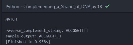
The next problem to solve “Complementing a Strand of DNA” were develop a reverse complement of a DNA string.
Using the reverse_complement function we used before, we can develop the complement using the sample dataset.
DNA_reverse_complement = {'A': 'T', 'T': 'A', 'G': 'C', 'C': 'G'}


def reverse_complement(seq):
    return ''.join([DNA_reverse_complement[nuc] for nuc in seq])[::-1]


reverse_complement_string = reverse_complement('AAAACCCGGT')

sample_output = 'ACCGGGTTTT'

if sample_output == reverse_complement_string:
    print('MATCH \n')
    print('reverse_complement_string: {}'.format(reverse_complement_string))
    print('sample_output: {}'.format(sample_output))
else:
    print('NO MATCH')
I added small if function to check if the result matches the sample dataset.
I got this result:
So now we can get the real data:


The code successfully worked:

In the next video, We calculate the GC content. {explain GC content TK}
def gc_content(seq):
    return round(seq.count('C') + seq.count('G') / len(seq) * 100)

I checked the GC content on an online tool. I got this result:

Which means my program is undercounting the GC content. I quickly found the issue, which is about the function has missing parenthesis over the seq.count.
Before:
def gc_content(seq):
    return round(seq.count('C') + seq.count('G') / len(seq) * 100)
After:
def gc_content(seq):
    return round((seq.count('C') + seq.count('G')) / len(seq) * 100)
Next we make function that calculates the GC content in a subsection.
def gc_content_subsec(seq, k=20):
    res = []
    for i in range(0, len(seq) - k + 1, k):
        subseq = seq[i:i + k]
        res.append(gc_content(subseq))
    return res
Next video to with Rosalind problems again using the function we just made.
The Rosalind problems ask us to work out the GC content. With sting labels in the dataset. This is called the FASTA data format. A widely used format for bioinformatics.

Following the video most of the work is formatting the data so it can be analysed for the GC content.
def read_file(file):
    with open(file, 'r') as f:
        return [l.strip() for l in f.readlines()]


def gc_content(seq):
    return round((seq.count('C') + seq.count('G')) / len(seq) * 100)
The first function reads the file. And strips the lines of whitespace. And separates them into lines.
FASTAFile = read_file("rosalind_problems\\test_data\gc_content_ex.txt")
# Dictionary for Labels + Data
FASTADict = {}
# String for holding the current label
FASTALabel = ""

for line in FASTAFile:
    if '>' in line:
        FASTALabel = line
        FASTADict[FASTALabel] = ""
    else:
        FASTADict[FASTALabel] += line
For loop adds data into the directory made before. It used an if statement to see the check the open sequence. The “>” symbol is used as the label (key) in the FASTADict. Then others lines are added as values to the key.
RESULTDict = {key: gc_content(value) for (key, value) in FASTADict.items()}
print(RESULTDict)
Output:
{'>Rosalind_6404': 54, '>Rosalind_5959': 54, '>Rosalind_0808': 61}Creates a new dictionary containing the GC content of values in the FASTA dict.
MaxGCKey = max(RESULTDict, key=RESULTDict.get) This uses the python max function to find the largest item in the dictionary.
print(f'{MaxGCKey[1:]}\n{RESULTDict[MaxGCKey]}')
The line of code prints the first result of the MaxGCKey. The uses that result in finding the name of the value in the RESULTDict.
Now we can download the dataset form, Rosalind.


Rosalind said to was wrong:

I think the error comes down to the program rounding down/up the result too much. As we can see from the sample output:

The sample out has a lot more decimal points which allow for a finer margining of error. To fix this I simply adjusted the round function to allow 6 decimal points:
def gc_content(seq):
    return round((seq.count('C') + seq.count('G')) / len(seq) * 100, 6)
This is the same data from above but allows decimal points to be used.
So I tried the program again with new data:


The program successfully worked:

For the next video, we work on using codons and translation. Codons are a sequence of 3 nucleotides in RNA and DNA strings. Mainly used for protein synthesis. Translations covert the RNA and DNA to proteins.
Copying the codon table turned directory to the structures file:

The translation function:
def translate_seq(seq, init_pos=0):
    return [DNA_Codons[seq[pos:pos + 3]] for pos in range(init_pos, len(seq) - 2, 3)]
[DNA_Codons[seq[pos:pos + 3]] >>> Goes through the DNA_Codons dictionary. The seq variable is the DNA string is inputted. The sequence is then sliced to check 3 nucleotides in the sequence. As the starting position is zero the first nucleotides may look like this:
seq = 'GCATCATTTTCCGACTTGCAGAAGACCTTCTTAGTGAAATTGGGATAACT'
seq[0:3]
'GCA'
>>> seq[3:6]
'TCA'for pos in range(init_pos, len(seq) - 2, 3) >>> Starts a for loop with the range of the stating position of the sequence (init_pos variable). Stops the for loop and the end of sequence minus 2. len(seq) - 2. The len(seq) – 2 in the for loop stops the program from reading a sequence that only has 2 nucleotides making it unable to read a codon.
Like this error:

Next function we develop is a function that counts the usage of a codon in a sequence.

def codon_usage(seq, aminoacid):
    """Provides the frequency of each codon encoding a given aminoacid in a DNA sequence"""
    tmpList = []
    for i in range(0, len(seq) - 2, 3):
        if DNA_Codons[seq[i:i + 3]] == aminoacid:
            tmpList.append(seq[i:i + 3])

    freqDict = dict(Counter(tmpList))
    totalWight = sum(freqDict.values())
    for seq in freqDict:
        freqDict[seq] = round(freqDict[seq] / totalWight, 2)
    return freqDict
tmpList = [] >>> creates temporary list to codonsfor i in range(0, len(seq) - 2, 3): >>> Makes loop that starts at 0 and then with the length of the sequence -2 with the increment of 3.if DNA_Codons[seq[i:i + 3]] == aminoacid:
tmpList.append(seq[i:i + 3])If statement checks if codon matches with amino acid selected in the Function. If the codon matches the amino acid then the codon is then added to the temporary list.
freqDict = dict(Counter(tmpList)) >>> creates a dictionary with amount of times the codon occurred in the list.
totalWight = sum(freqDict.values()) >>> Adds up all the number together so it later be used to calculate the percent of amino acids
for seq in freqDict:
        freqDict[seq] = round(freqDict[seq] / totalWight, 2)
A small for loop that calculates the percentage of the codon. By dividing the frequency of codon with the total number codons with totalWight. The rounding by decimal points.
Learning some bioinformatics with Python
I’m making a mini-project about bioinformatics. I’m going to be following this well put together YouTube series by rebel coder.
According to Wikipedia, is an interdisciplinary field that develops methods and software tools for understanding biological data, in particular when the data sets are large and complex.
Bioinformatics has become a more viable field as the increase of computing power and major improvements in genetic sequencing. Allows us to analyse biological data at a scale never seen before.
Examples can include:
Genomics: Studying a person genome to find causes of diseases and complex traits. Is now easier as technology can now go through millions of units of DNA in quicker time.
Epidemiology: Nextstrain is a website that tracks how pathogens evolve. By looking thorough genome of the pathogen and finding and changes.

Figure 1 History Tree of SARS-COV-2 https://nextstrain.org/ncov/global
Drug Discovery: Bioinformatics can used to help find drugs using DNA stored in a database to test with chemical compounds. One example: http://click2drug.org/
A very important distinction I found from the website https://www.ebi.ac.uk:
Bioinformatics is distinct from medical informatics – the interdisciplinary study of the design, development, adoption and application of IT-based innovations in healthcare services delivery, management and planning. Somewhere in between the two disciplines lies biomedical informatics – the interdisciplinary field that studies and pursues the effective uses of biomedical data, information, and knowledge for scientific enquiry, problem-solving and decision making, motivated by efforts to improve human health. - https://www.ebi.ac.uk/training/online/course/bioinformatics-terrified/what-bioinformatics-0
In the first video of the series, we started work on validating and counting nucleotides.
Nucleotides are units that help build up DNA and RNA structures. Nucleotides contain a phosphate group. A five-carbon sugar and They have 4 different nitrogenous bases adenine (A), thymine (T), guanine (G), and cytosine (C).

Figure 2 The Structure of DNA MITx Bio
Sources
https://en.wikipedia.org/wiki/Nucleotide,
https://www.youtube.com/watch?v=o_-6JXLYS-k - The Structure of DNA MITx Bio
https://www.youtube.com/watch?v=hI4v7v8AdfI& - Introduction to nucleic acids and nucleotides | High school biology | Khan Academy
The first function I made by watching the video. Was a DNA validator. This function will check if a string has incorrect characters that are not nucleotides. adenine (A), thymine (T), guanine (G), and cytosine (C). Then return false if any incorrect characters are in the string.

The function I made from the video is frequency count for the nucleotides. Counts the number of nucleotides in strings and counts them in a dictionary.
def countNucFrequency(seq):
    temFreqDict = {'A': 0, 'C': 0, 'G': 0, 'T': 0}
    for nuc in seq:
        temFreqDict[nuc] += 1
    return temFreqDict
nucleotides = ['A', 'C', 'G', 'T']
def validateSeq(dna_seq):
temsep = dna_seq.Upper()
for nuc in temsep:
if nuc not in nucleotides:
return False
return temsepnucleotides = ['A', 'C', 'G', 'T'] defines the correct characters that should be in the sequence.
def validateSeq(dna_seq):defines the function with argument called dna_seq.
temsep = dna_seq.Upper() sets a variable that changes the dna_seq to uppercase. So the input is correctly compared to the nucleotides list which contains uppercase letters.
for nuc in temsep: >>> for loop that checks each character in the temseq.
if nuc not in nucleotides:>>> An if statement that checks the character is not in the nucleotides list.
return False. >>> Function returns if statement from above is true
return temsep. >>> Function returns the sequence if all characters are in the nucleotides list.
Testing the function with a random string:
from dna_toolkit import validateSeq

rndDNASeq = 'ATTACG'

print(validateSeq(rndDNASeq))
Testing with wrong character
rndDNASeq = 'ATTACGX'

print(validateSeq(rndDNASeq))
Testing with mixed cases
rndDNASeq = 'ATTACGcAat'

print(validateSeq(rndDNASeq))
Next in the video, he created a random DNA generator.
rndDNASeq = ''.join([random.choice(nucleotides) for nuc in range(20)])‘’.join This joins the characters together with no spaces.
Random.choice(nucleotides) Chooses a random character based on the list.
for nuc in range(20) sets a for loop with the range 20. Setting the length of the DNA string.

In the next YouTube video, we solve Rosalind problems. http://rosalind.info is a website that provides bioinformatics problems to solve.
First problem will be working is called Counting DNA Nucleotides. According to the video we will adapting the countNucFrequency we made earlier to solve the issue.
def countNucFrequency(seq):
    temFreqDict = {'A': 0, 'C': 0, 'G': 0, 'T': 0}
    for nuc in seq:
        temFreqDict[nuc] += 1
    return temFreqDict


Dna_string = 'CAGCGCTTTTCGACTCCAGT'
result = countNucFrequency(Dna_string)
print(' '.join([str(val) for key, val in result.items()]))
The most important bit of this code is the formatting. As Rosalind requires a certain output:

In the dictionary output from earlier needs to change into format in the picture.
print(' '.join([str(val) for key, val in result.items()]))‘ ’.join >> adds a space between the numbers.
([str(val) for key, val in result.items()] >> List comprehension of looping through the dictionary.
str(val) for key >> Turns val variable (count) in into string so it can be printed and formatted. Does this for each key in the dictionary.
, val in result.items() >> returns items in results directory
Now I download the dataset and use the program I created.

Downloading the dataset gives us a text file of a long DNA string

I changed the DNA string variable to the DNA string from the text file.

The second video works on transcription and Reverse Complement. Transcription is the process of converting DNA to mRNA. Reverse Complement creates the second complementary strand of DNA. That is in reverse order. Each of the bases pair to specific bonds. Adenine with Thymine and Cytosine with Guanine. The structure of DNA is that there are two strands where they are facing opposite directions. This is done as two-stranded DNA can be written as one stranded.
Source: DNA structure and the Reverse Complement operation
We replace thymine(T) with uracil(U) as this is the base used in RNA.
def transcription(seq):
    return seq.replace('T', 'U')
As can see the output shows uracil(U) instead of thymine(T).
DNA_reverse_complement = {'A': 'T', 'T': 'A', 'G': 'C', 'C': 'G'}
This directory changes the base of the nucleotide so it matches with base-pairing rules. Adenine with Thymine, Cytosine with Guanine.
'A': 'T', 'T': 'A' >>> Adenine gets swapped with Thymine. ('A': 'T') and vice versa ('T': 'A')
'G': 'C', 'C': 'G' >>> Guanine gets swapped with Cytosine. ('G': 'C') and vice versa ('C': 'G')
def reverse_complement(seq):
    return ''.join([DNA_reverse_complement[nuc] for nuc in seq])[::-1]
The DNA_reverse_complement dictionary is used to replace characters when the DNA sequence is being reversed.
The reverse_complement function changes each nucleotide with the dictionary, then reserves the sequence with [::-1]

To check if the reverse complement is correct I inputted the sequence into this website. That does reverse complements for you and copied their result. Then I used the find and search feature of my code editor to match the string.


The reverse complement matches the answer. So, the function works correctly.
In the third video, we solve Rosalind problems again using the functions we created in DNA toolkit of earlier.
The Rosalind problem is asking us to transcribe DNA to RNA.

In the program, I copied the transcription function. And passed the DNA string into the function. Which was saved into a variable called RNA_string.
def transcription(seq):
    return seq.replace('T', 'U')
DNA_string = 'GATGGAACTTGACTACGTAAATT'
RNA_string = transcription(DNA_string)
print(RNA_string)Used the Find feature from my code editor to see if the output matches the sample output from the website.
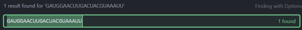
It does so the program successfully transcribes DNA to RNA.
So now we can use the real data from the website:


I submitted the RNA string into Rosalind. Then I got this result:

I will post more about me learning about this topic.
Please check rebelcoder’s channel as im basically learning almost everything about this topic from his videos.
Bookstore vs Income Part 7

Looking back at the database of income I noticed that some of the data points have the wrong incomes. I started to check this because the “city of Westminster” data point had a low income for its location. I think this error happed because in the count_borough csv I had “Westminster” as “City of Westminster” changing the order of the dataset. So, when the Incomes were added the Croydon income (next data point after the city of Westminster) was added to the Westminster data point.
Name of Westminster data point in income excel file

Name of Westminster data point in my count of bookstores in the borough.

I worked on adjusting the count dataset. Using pandas to converting it into a dataframe, adding column names. And removing the 'London Borough of’ and ‘'Royal Borough of’ prefixes. The stuff I did manually first time round.
bookstore_df = pd.read_csv('filtered_dataset_boroughs.csv')
count = bookstore_df['Borough'].value_counts().rename_axis('Borough').reset_index(name='Count')
print(count)

count['Borough'] = count['Borough'].str.replace('London Borough of ', '')
count['Borough'] = count['Borough'].str.replace('Royal Borough of ', '')
count['Borough'] = count['Borough'].str.replace('City of Westminster ', 'Westminster')

print(count)
Next I compared the names of the count dataframe and the income names. To find the missing values after value count. As the value count does not return any values that did not occur once.
compare_1 = tax_year_without_pop['Area'].reset_index(drop=True)
compare_2 = count['Borough']
compare_1 = compare_1.sort_values()
compare_2 = compare_2.sort_values().reset_index(drop=True)
# print(compare_1)
# print(compare_2)

idx1 = pd.Index(compare_1)
idx2 = pd.Index(compare_2)
print(idx1.difference(idx2).values)
append_values = idx1.difference(idx2).values

['Barking and Dagenham' 'Bexley' 'Brent' 'City of London' 'Hackney'
 'Hammersmith and Fulham' 'Kingston-upon-Thames' 'Lambeth' 'Newham'
 'Richmond-upon-Thames' 'Southwark' 'Westminster']
A few are duplicates but they can be removed after adding to the dataframe. To add to dataframe I need to turn this list into the dataframe as the same shape as the one I wanted to append to.
First I made a list a zeros with same length as the list.
zero_list = [0] * len(append_values)
[0, 0, 0, 0, 0, 0, 0, 0, 0, 0, 0, 0]
Made a new dataframe object by zipping the list up:
extra_name_df = pd.DataFrame(list(zip(append_values, zero_list)), columns=['Borough', 'Count'])
Now I need to get rid of the duplicates like Richmond, Kingston and Westminster.
extra_name_df = extra_name_df.drop([3, 6, 9, 11])
Then appended this dataframe with my exiting dataframe.
count = count.append(extra_name_df, ignore_index=True)
Now I can update the count_borough CSV file used to plot the data.
count.to_csv('count_borough.csv').I later had to just the code above due some values being missing and the Westminster still having the city word changing the order of the dataset.
Next is to add the general direction of the borough. Using compass names like last time. The Boroughs were reorganised using this Wikipedia page. A government plan on how is London is split into sub-regions.

Using the table, I converted the value into a regex pattern so pandas can scan strings in my dataframe and return the sub-region.
North_names = '(Barnet|Enfield|Haringey)'
South_names = '(Bromley|Croydon|Kingston upon Thames|Merton|Sutton|Wandsworth)'
East_names = '(Barking and Dagenham|Bexley|Greenwich|Hackney|Havering|Lewisham|Newham|Redbridge|Tower Hamlets|Waltham Forest)'
West_names = '(Brent|Ealing|Hammersmith and Fulham|Harrow|Richmond upon Thames|Hillingdon|Hounslow)'
Central_names = '(Camden|City of London|Kensington and Chelsea|Islington|Lambeth|Southwark|Westminster)'
Then created a new column with the same length borough column. Where the sub-regions will be stored.
count_df['Compass'] = [0] * len(count_df['Borough'])
I used Boolean masking to return a string if pandas contains function matches true.
count_df['Compass'] = count_df['Compass'].mask((count_df['Borough'].str.contains(
    North_names) == True), other='North')

count_df['Compass'] = count_df['Compass'].mask((count_df['Borough'].str.contains(
    South_names) == True), other='South')

count_df['Compass'] = count_df['Compass'].mask((count_df['Borough'].str.contains(
    East_names) == True), other='East')

count_df['Compass'] = count_df['Compass'].mask((count_df['Borough'].str.contains(
    West_names) == True), other='West')

count_df['Compass'] = count_df['Compass'].mask((count_df['Borough'].str.contains(
    Central_names) == True), other='Central')
Now I can update the CSV file which saves this dataframe.
count_df.to_csv('Borough_income_count.csv', index=False)Now running the previous matplotlib code I get this result:

As we can see the values have changed quite a bit. Croydon is label because in the last graph the index was the value of the city of Westminster. I will now adjust the annotation so it can annotate Westminster, not Croydon.

I also added the line show the correlation in the graph
x = compass_df['Count'].astype('float')
y = compass_df['Income'].astype('float')

b, m = polyfit(x, y, 1)
plt.plot(x, b + m * x, '-')
I later changed the transparency of the data point increase the look of the graph.
for name, group in groups:
    ax.plot(group["Count"], group["Income"], marker="o", linestyle="", label=name, alpha=0.6)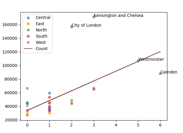
Bookstores vs income part 6

Now we need to prepare the data for the analysis. For the linear regression, the question will ask if there is a correlation between the number of bookstores in a borough and its income. So, to do this I need to make one more dataset containing the name of boroughs and the number of bookstores it has. I typed a few lines of code that should count the borough values in the borough column.
bookstore_df = pd.read_csv('filtered_dataset_boroughs.csv')
count = bookstore_df['Borough'].value_counts()
print(count)
As we can we pandas gave the count of the bookstores in the boroughs. Some boroughs are not in the count because of the bookstore is not in a specific borough. For example, Southwark and Lambeth do not have bookstores so they are not included in the count. I will export the count into a CSV file then make edits by adding the boroughs that do not appear in the count. Got this result:

This means I did something wrong as the name of boroughs does not appear. I fixed the issue by setting the index of the to_csv to true.

I added the boroughs that did not have any of the bookstores. And deleted the ‘London Borough of’ and ‘Royal London Borough of’ phrases. Which is easier than typing of the prefix into the recently added boroughs. And should make the data easier to read.

Now we just need to attach the income to the dataset. So I can add the correct income to the boroughs, I will sort both of the datasets by alphabetical order.
count_df = pd.read_csv('count_borough.csv')
count_df = count_df.sort_values('Borough')
tax_year_without_pop = tax_year_without_pop.sort_values('Area')
print(count_df.head())
print(tax_year_without_pop.head())
I will be using the mean income so I will drop the median column.

Now can take the mean column and add to the count dataframe.
mean_income = tax_year_without_pop['Median £']
count_df['Income'] = mean_income

print(count_df.head())
As we can see there is something wrong with the income column. There are missing values. And the income is in the wrong rows. I later fixed the issue by resetting the indexes of mean income series and the count dataframe. The reason why resetting fixes the issue that when the boroughs were sorted by alphabetical order the index was moved around. When I tried to add the mean income column into the dataframe.
Pandas matched the values to the index. But this was not needed as the income was already sorted by alphabetical order. So resetting the index of the mean income column allowed the values to stay in place while changing the index to normal ascending order. And changing the count dataframe did the same thing by keeping the values in place. So when I added the column into the dataframe the values able to match correctly without pandas moving the values around because of the index.
mean_income = tax_year_without_pop['Mean £']
mean_income = mean_income.reset_index(drop=True)
print(mean_income)
count_df = count_df.reset_index(drop=True)
count_df['Income'] = mean_income
Now we can start making a scatter plot to see how the data looks. By using pandas built in matplotlib functions I’m able to plot the data.
ax1 = count_df.plot.scatter(x='Count', y='Income')
plt.show()
As we can see most of the data point are clustered around the 0-1 bookstores area. There is some meaning we can take from the graph but I will swap the axes around to see if the graph look slightly better.

The axes swapped around:

Swapping the axes around does change the graph that much.
I went back to the normal axes then added a zero to the y-axis.

I then plotted a line though the data to see the correlation in the data.
ax1 = count_df.plot.scatter(x='Count', y='Income')
ax1 = ax1.set_ylim(bottom=0)


x = count_df['Count'].astype('float')
y = count_df['Income'].astype('float')

b, m = polyfit(x, y, 1)
plt.plot(x, y, '.')
plt.plot(x, b + m * x, '-')

plt.show()
As we can see there is a positive a correlation between the number of bookstores and income. I will next delete the outliners to see if it changes the appearance of the graph.
count_df['Income'] = count_df['Income'][count_df['Income'].between(
    count_df['Income'].quantile(.15), count_df['Income'].quantile(.85))]

count_df = count_df.dropna()
print(count_df)
https://nextjournal.com/schmudde/how-to-remove-outliers-in-data

When removing the outliers we can see the income range is reduced. And the bookstore count. As the bookstore count reduced from 6 to 3. And the income range of the y-axis from 160000 to 60000.
I am going to bring the outliers back to annotate and add colours to the data points. To make it clearer. I’m going to colour the data points based on the location of the bookstore. North, south, east, west, and central London.
To do that I exported the count dataframe. Then created a new column where the category will be. I added the compass location of the bookstore.

The I grouped the data frame by the labels.
compass_df = pd.read_csv('Borough_income_count.csv')
print(compass_df)
groups = compass_df.groupby('Compass')

for name, group in groups:
    plt.plot(group["Count"], group["Income"], marker="o", linestyle="", label=name)

plt.legend()Now we can see the results. One pattern I see is the East London boroughs do not have more than one bookstore.

I will next annotate the outliers. While working on getting the annotations able was able to annotate all of the data points because I was still struggling to annotate a few data points.
for i, txt in enumerate(compass_df['Borough']):
     ax.annotate(txt, (compass_df['Count'].iloc[i], compass_df['Income'].iloc[i]))
As we can see the annotations make the graph look messy. As much of the text bunched together. I was able to later work out how label one data point. Using the code from above.
ax.annotate(compass_df['Borough'].iloc[1],
            (compass_df['Count'].iloc[1], compass_df['Income'].iloc[1]))
The compass_df['Borough'].iloc[1] is the name of the borough. Taken from the borough series. The iloc selects the second value(index starts at 0) in the series. The borough name is returned as text as this piece of code is located where it returns text.
compass_df['Count'].iloc[1], compass_df['Income'].iloc[1]Similar to the first, compass_df['Count'].iloc[1] and compass_df['Income'].iloc[1] selects the integer 1 in their series. The count series is first because it is on the x-axis. And the annotate function has the order x-axis first and y-axis second.

Now I know how to annotate the data points, I can now annotate the outliers which I originally wanted to.
