Graphs with flask
This project we be me trying to graph some of google sheets data in into a flask website. Using this website to guide me. The spreadsheet I will be trying to graph on the flask website is this:

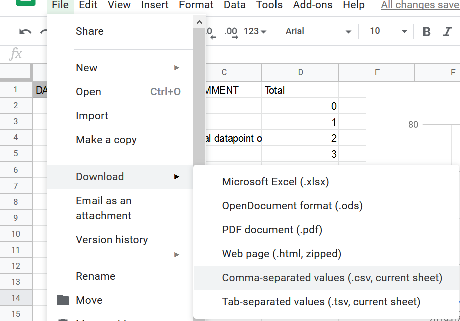
This is a graph of the amount of strangers I’ve tried to talk to in a given amount of time. To have the file in ready for are python program we need to export the spreadsheet into an csv file.
Create an new environment or activate an old where you can have the flask package.
Conda install flask
Pip install flask
After that make an templates folder for the html and app.py to run the data.

The tutorial from above hard-coded the data in the app.py file but as we getting are data from a csv file it will have to be done a little bit differently.
So, we can dealing with the columns more easier I decided to import pandas.
Simple df.head() statement below:

Now we need to separate the columns into list and save it as a variable so we can use them on are graphs. The comment column is not useful so we can drop that.
To turn the columns into list run this code below:
Now the printed results of the first 10 values:
Dates = df['DAYSTAMP'].tolist()

Values = df['Values'].tolist()

Totals = df['Total'].tolist()
Now we the data needed for are program, now we can start coding the flask section of the file.
We going to borrow some the code from the tutorial for writing the app routes and template function.
@app.route('/bar')
def bar():
    bar_labels = Dates
    bar_values = Values
    return render_template('bar_chart.html', title='Convo bar', max=17000, labels=bar_labels, values=bar_values)

@app.route('/line')
def line():
    line_labels = Dates
    line_values = Values
    return render_template('line_chart.html', title='Covo Line', max=17000, labels=line_labels, values=line_values)

@app.route('/pie')
def pie():
    pie_labels = Dates
    pie_values = Values
    return render_template('pie_chart.html', title='Convo Line', max=17000, set=zip(Values, Dates, colors))
Also we need to make the html files to render the template. These were borrowed from the tutorial again.

The graphs does not load correctly as we can see below:

The bar graph has the same issue:

The issue I found is that the max variable which sets the highest number for the y axis is 1700. This makes the numbers in the close to zero as they are now where close to 1700.

I will change it to max 100. The results are below:

As we can see the change did work. But the issue is now formatting issues. As the dates on the x axis are stuffed into each other looking a bit messy. From googling around you need to add maxTicksLimit to the graphs options. But from testing it does not work so decided make my own custom template based on the chart JS usage example.
But I struggled with fixing this problem so an article in later date my be released.